9 Figma design system tips
A collection of handy tips to improve your design system workflow in Figma.
Originally published at marcandrew.me on October 6th, 2021.
With this article, I’ve listed a few quick and easy methods to help you speed up your design workflow in Figma.
Most of these suggestions are ideal for when you’re dealing with design systems or huge design files, but they’re also suitable for regular day-to-day use within Figma.
Some of these you may already be familiar with, but hopefully, you’ll find the occasional undiscovered treasure in here as well.
Let’s get started…
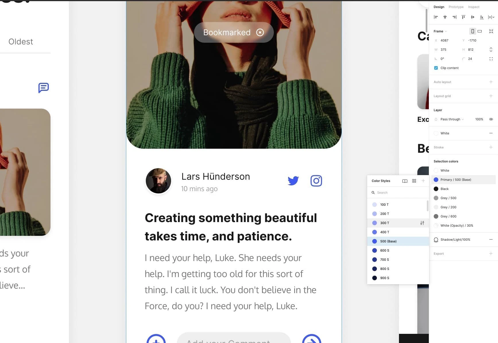
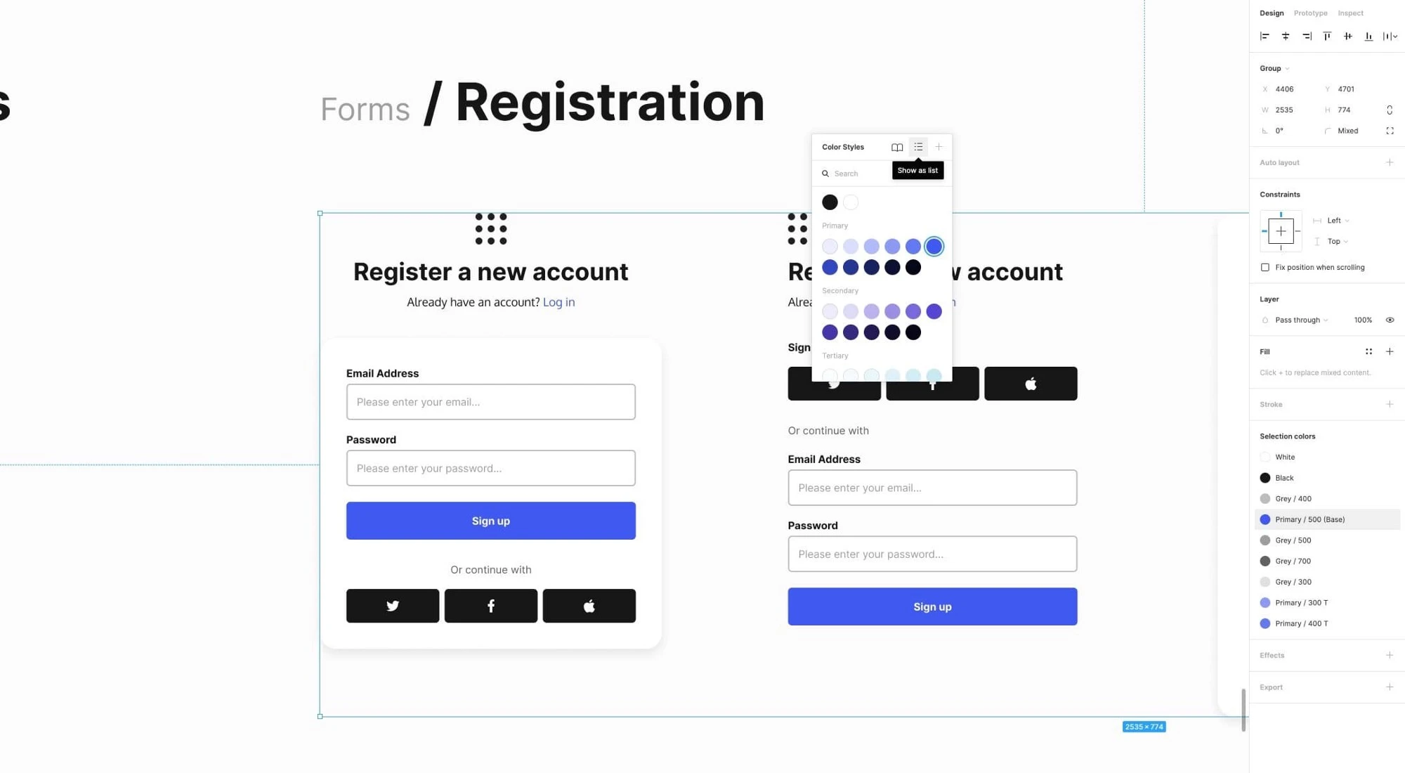
1. Use Selection Colors when changing colours in bulk.
When working with more substantial Components and needing to change colours quickly, don’t waste time by clicking into separate elements and changing colours one by one.
Use the Selection Colors panel to modify those colours in bulk and much more quickly.
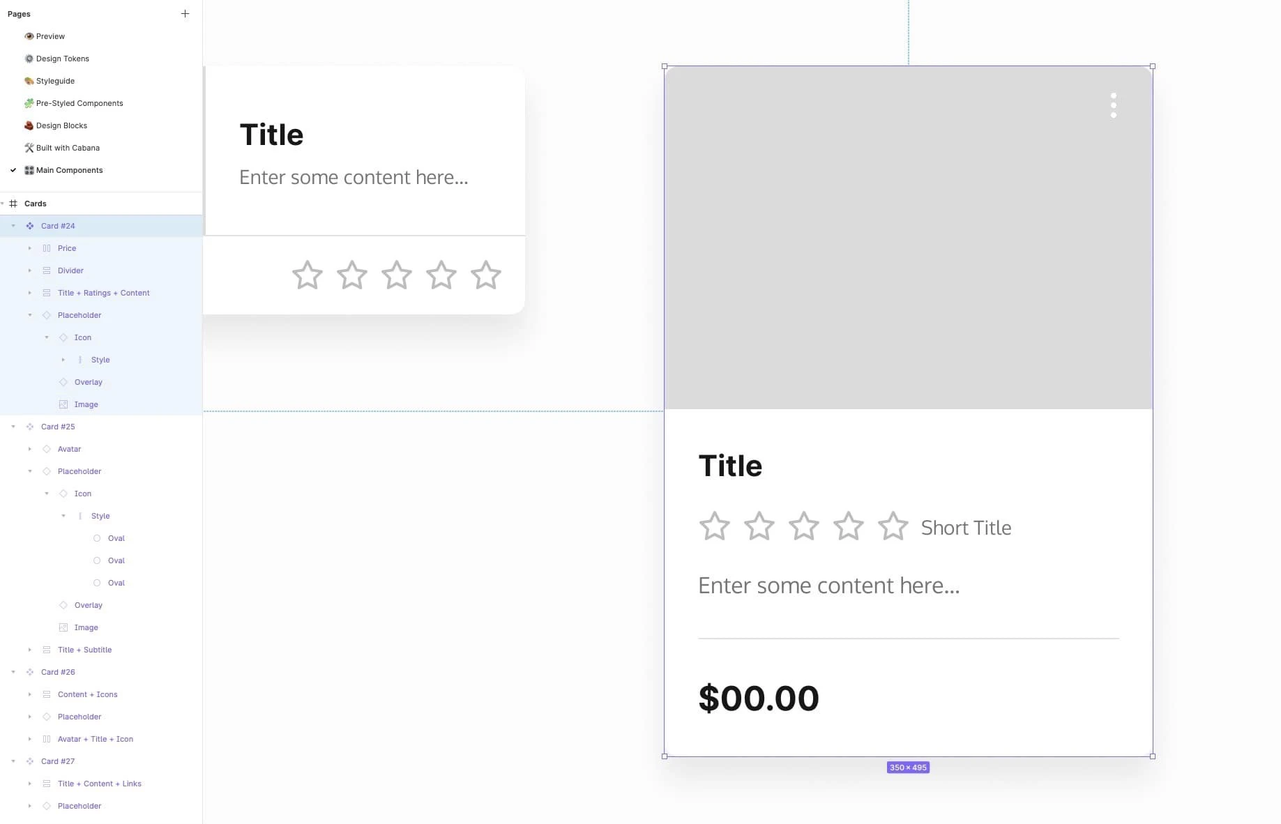
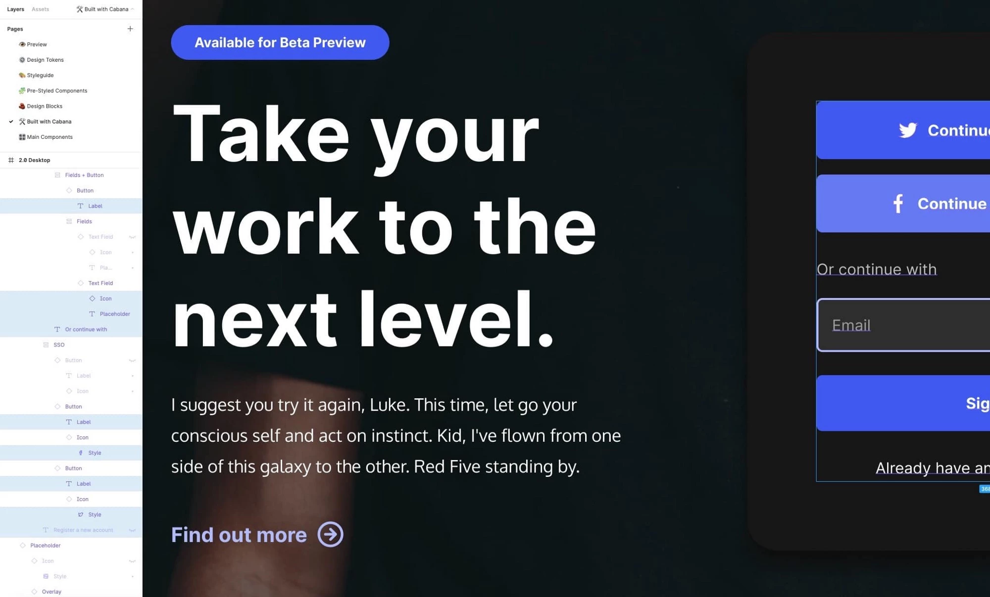
2. With this helpful shortcut, you can keep your Layers tidy.
In the past, I’ve been guilty of leaving my Layers panel looking like organised chaos, with group after group, element after element open, making it difficult to discover items in the Layers panel.
Use the simple keyboard shortcut Alt + L to collapse all Layers and keep your panel tidy and focused on the project at hand.
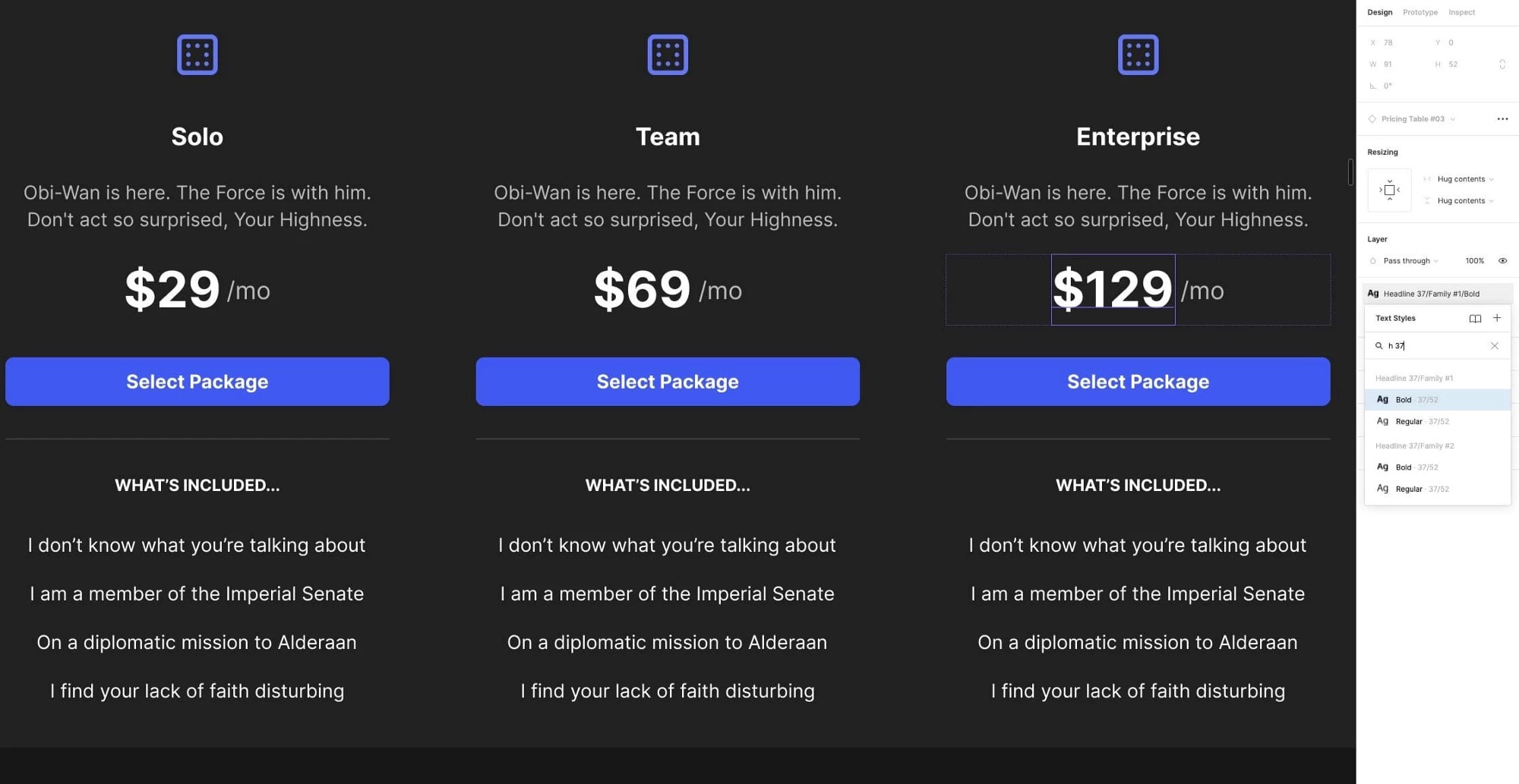
3. To locate Text Styles faster, just use Search.
When swapping out Text Styles, don’t endlessly scroll through the options to find what you need. Use the Search.
It’s faster to type in Headline 2 or H2 than to navigate through an extensive list of Text Styles to find a suitable option.
And don’t always feel that you have to go ahead and type out the full style name in the Search field, for example, ‘Headline 37’.
Something shorthand like ‘H 37’ is all you need.
Keep it short and sweet, and work through your designs even faster.
4. To navigate Color Styles more quickly, choose the List option.
As I previously mentioned, when working with an extensive Design System, it is beneficial to navigate Colour Styles, Text Styles, and so on as quickly as possible.
Switching to the List option (rather than the Grid option) in the Inspector, in my opinion, always makes it easier to browse your Color Styles with the extra benefits of the Label displayed rather than just the colour swatch alone.
5. To navigate your Layers faster, use these keyboard shortcuts.
I’ve been guilty in the past of scrolling and clicking through numerous Groups and Parent containers in the Layers panel to find the relevant element.
Save yourself some time and avoid using the mouse.
Use the keyboard commands Tab and Enter to quickly drill down through elements in your Layers panel to locate what you’re looking for fast.
Oh. And hold Shift while using the keys I just mentioned to navigate back up through your Layer groups and parent containers.
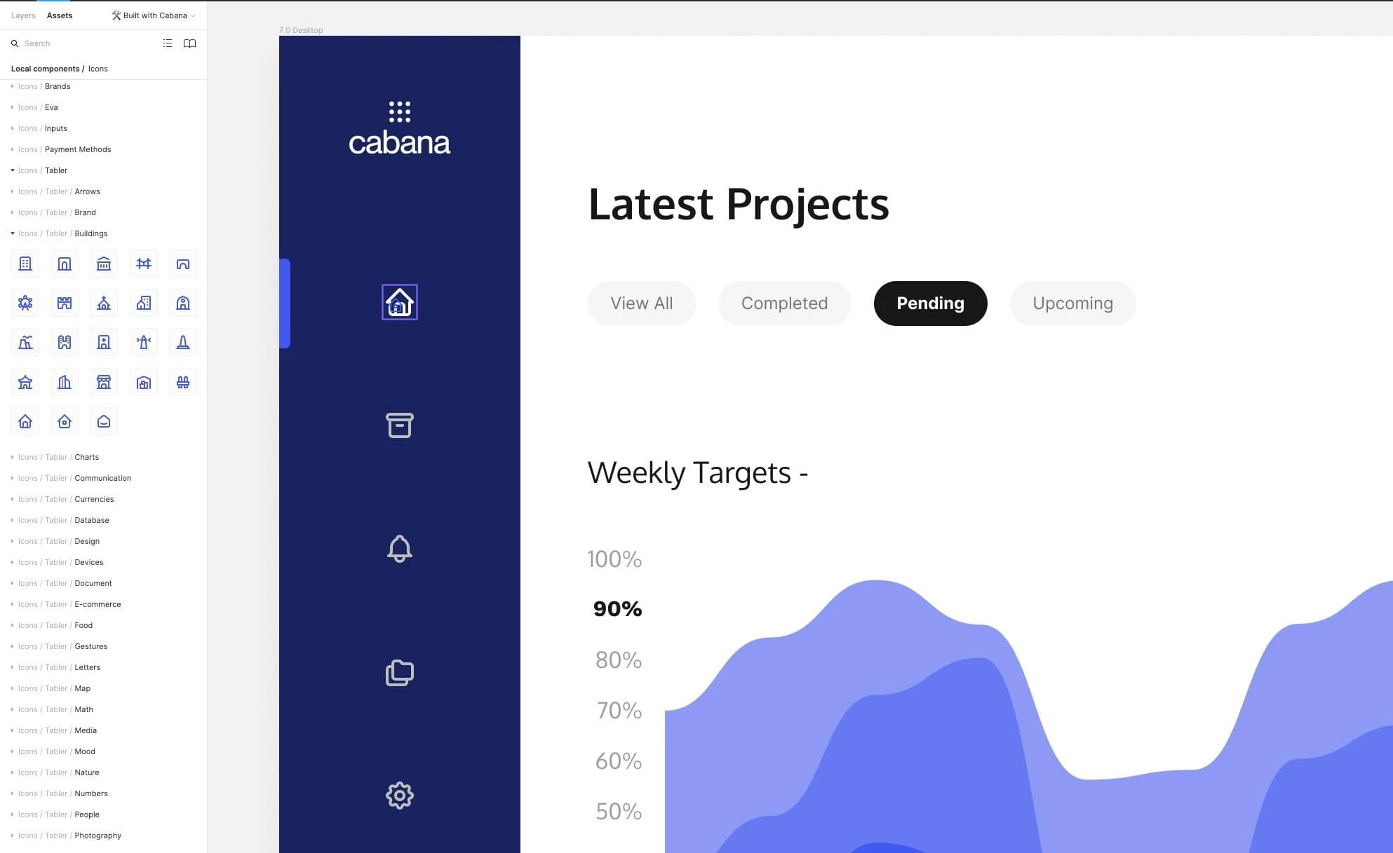
6. Swap-out Components faster with this handy shortcut.
This tip has proven useful when working on different design revisions, and it works best when switching out Icons in a project.
For example, select an icon from your Assets panel and then, while holding down Alt + Cmd, drag your icon across your design, where you’ll notice a purple border around your existing icon, and then swap it out in record time.
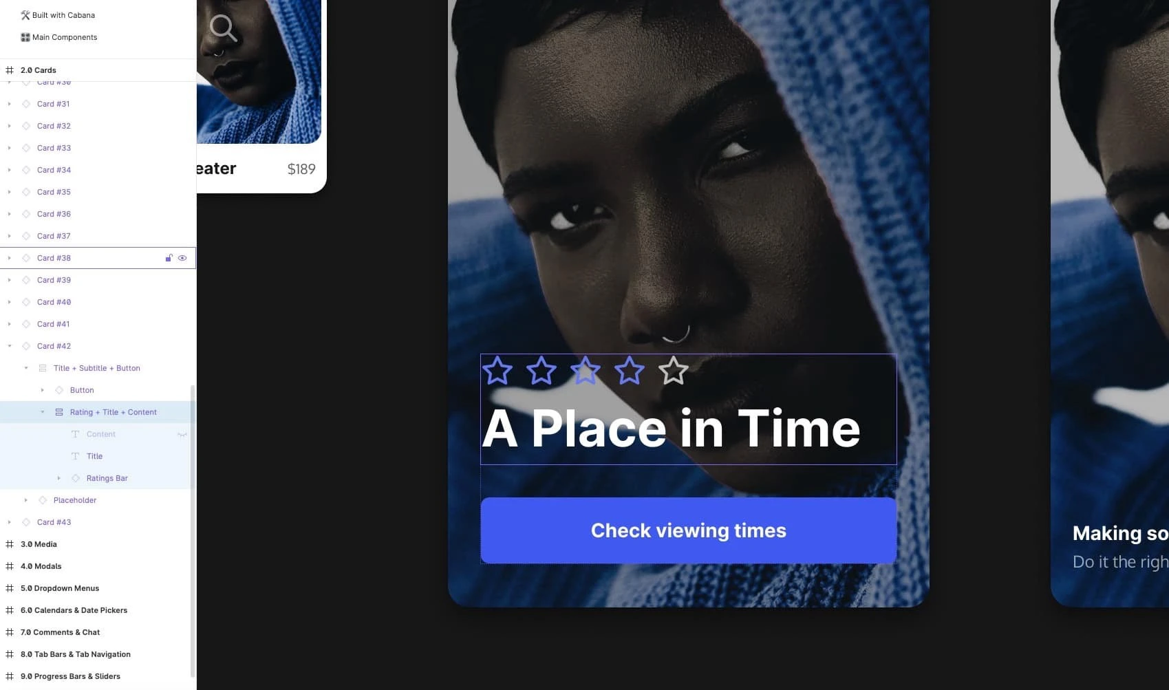
7. Resize your Auto-Layout powered Components in the blink of an eye.
When working with a Main Component that you’ve inserted into your project, call upon the Eye icon in the Layers panel to quickly hide elements you don’t require.
This handy little icon will also make your Component resize and adjust accordingly and enable you to have a Component perfectly suited to your requirements.
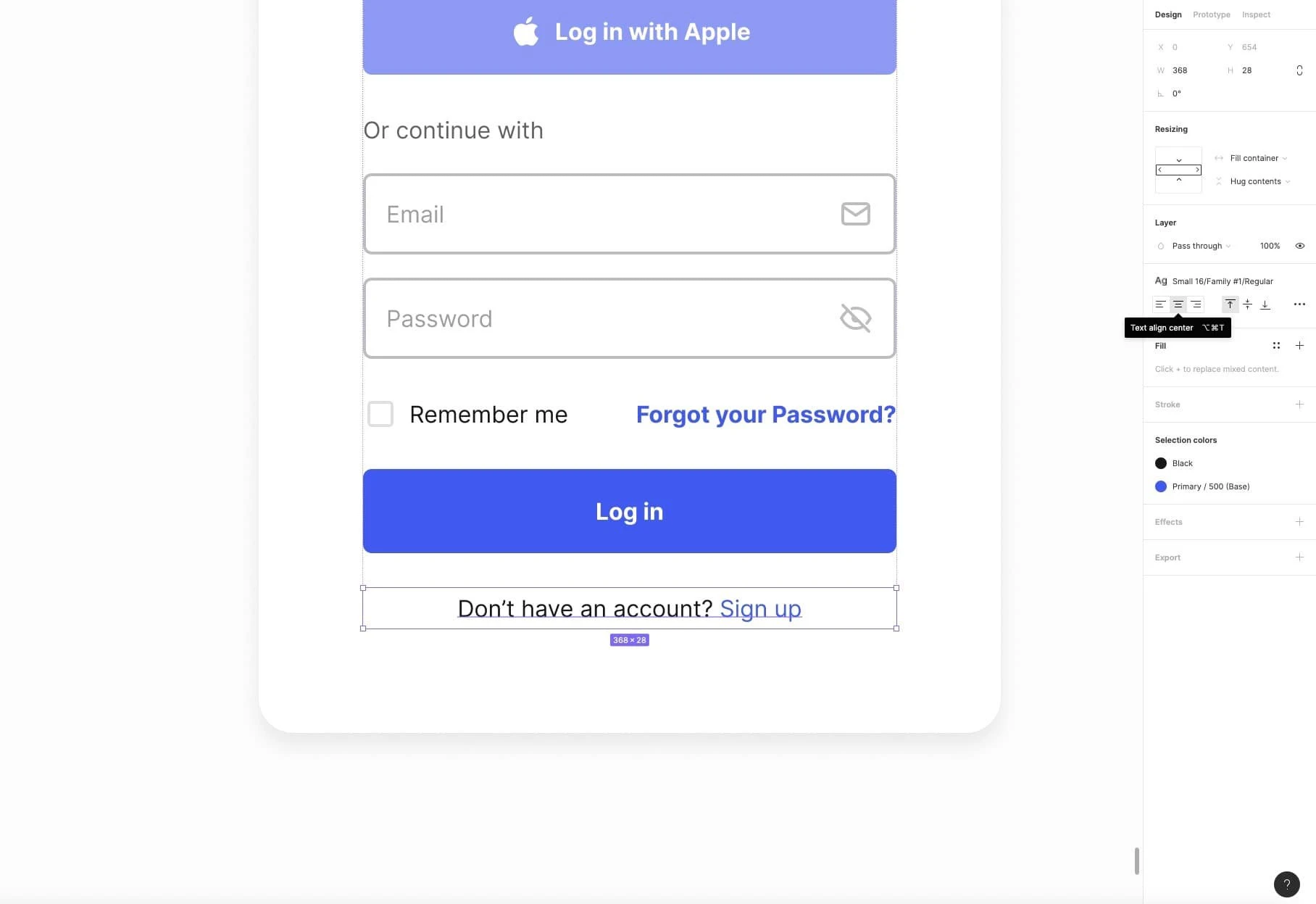
8. Avoid text-alignment confusion when using Auto-Layout.
When it comes to using Auto Layout powered Components, one thing that can cause users a bit of confusion is why those pesky text elements are not aligning like everything else in the component.
Worry no more.
With text elements, remember to jump into the text alignment settings and make the necessary changes there to have your text align correctly with the rest of the elements.
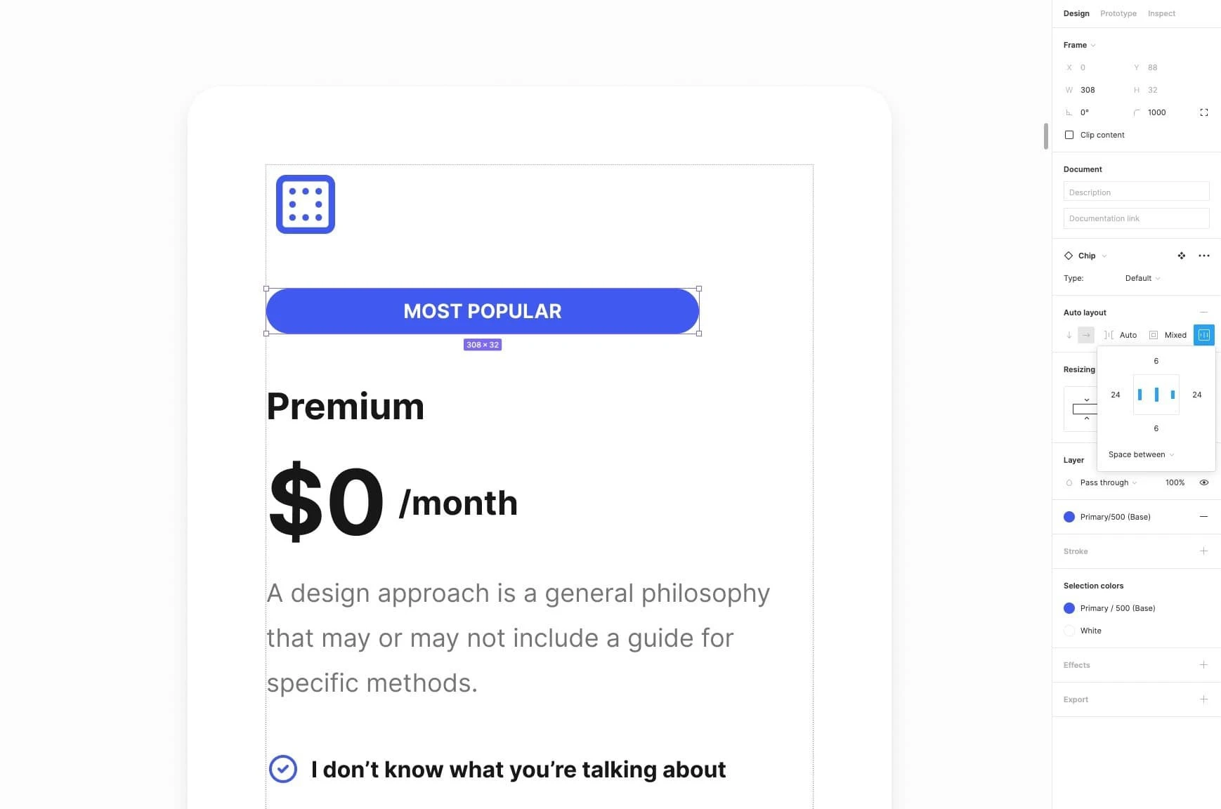
9. Component not resizing correctly? Have you checked the Spacing?
On certain Components with Auto Layout attached to them, you may see some strange visual quirks when you try to resize them manually.
For example, with something simple like a Chip Component. You type away to change the label, and everything expands perfectly.
But, when you want to go ahead and grab those resizing handles, things don’t always look so great.
No problem. Just jump into the Auto Layout settings and set the spacing from Packed to Space Between.
Hopefully, you’ve found a few helpful tips here that you can put into action right now to help enhance your workflow today.
Figma is an excellent tool with so many valuable and time-saving shortcuts that I’m sure you’ll discover many more as well.
