In this article, you will learn more about white space and why it is so important in the design of UX.
White space is a very useful technique when creating design layouts. When designing a layout, it is important to let the elements on the page breathe. The best way to do this is to introduce what is known as white space.
White space is not a difficult technique to learn. Basically, you just need to create space around each element, whether it's text, images, or graphics. On the page, make sure that you leave enough space around each element so that it has its own visual focus. This way, the viewer can get a good idea of your design and understand what you are trying to say. For this reason, empty space is a legitimate design element that has a great impact on the user experience.
It's important to remember that negative space in web design does not have to be only white - you can use any color, texture, even patterns or background images.
Types of white space
When designing user interfaces for websites and mobile apps, the use of negative space is an important factor in making the interface user-friendly and navigable.
There are two types of white space:
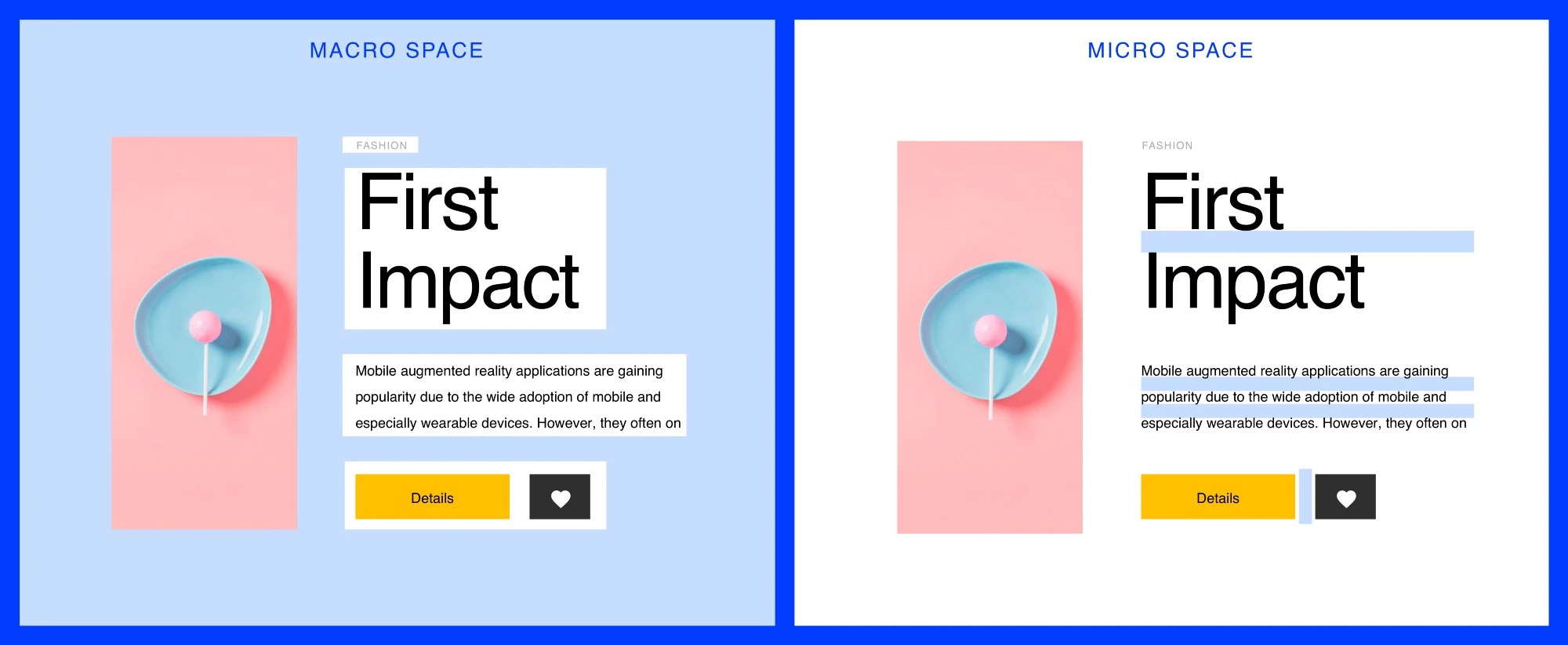
- Macro-space: This term refers to the space between the main elements of a website or mobile application and the space around each part.
- Micro-space: This refers to small gaps within an element: line spacing in text, gaps between images, separator lines, and more.
Why is negative space important?
Both clients and some designers want to fit as many elements and features as possible on a page or screen because they think it's useful for consumers. But this is a misconception: in fact, users do not need everything at once. Moreover, too many elements without enough air significantly increase the level of distraction: you will be overloaded with information and interactive elements, and users will have to strain to find what they need.
White space separates content, highlights the important things and creates balance.
Let’s take a look deeper on the advantages of using whitespace
Easier to read the page
When there is not enough space between elements, they become hard to read and require extra effort to spot. Balancing negative space, especially micro space, solves this problem and makes the reading process more natural.
Improves the visual hierarchy
Empty space helps users divide the content into easily readable parts and focus on the details. This is similar to the pauses in stage performances by artists, giving the audience time to understand and comprehend.
Allows visual communication between elements
White space not only creates harmony and balance and contributes to branding, but it can also be used to guide the reader from one element to another.
Design composition does not appear overloaded
Elements that do not take up enough space greatly increase the level of distraction. The key is to balance the design and use white space as a great tool to separate pieces of content to improve accessibility and user experience.
Focus the user's attention on the most important elements
The more empty space there is around a design element, the more attention it attracts. White space draws the user's attention to the search bar and the company logo. This way, you can use white space to create semantic focal points on a web page and draw attention to important information.
Adds style and elegance to the page
White space can become a design pillar for a business and make the design style unique. Such stylistic choices stick in the minds of users and set the site apart from the competition.
Blank space is not a blank canvas, but a powerful design tool. Using empty space is both art and science. Understanding how much white space to use for a good layout takes some practice. The more you design, the more you learn. Try it out and experiment with it.