How to create stronger case studies
Step off of the design portfolio assembly line with some critical thinking.
The way designers build their case studies is broken. If you’re a design school or bootcamp graduate, odds are that your portfolio will look the same as everyone else’s. It’s not your fault, it’s a product of the system. Following case study templates doesn’t require critical thinking, but it’s what you’re taught to do, right?
And if we’re being completely honest with ourselves, the things case studies focus on aren’t impressive. If you’re selling yourself as a designer I’m going to assume you can make something as simple as wireframes.
As someone who’s previously hired a designer, I can tell you that once you’ve seen dozens of case studies, you’ve seen them all. It’s no longer enough to show your outcomes, you need to share the story of how you got there.
The importance of narrative
In Simon Sinek’s talk Start With Why, he explains that the most successful companies focus their messaging on their mission rather than the benefits of their product. “People don’t by what you do they buy WHY you do it”. The same is true for selling yourself.
Being a clear and concise storyteller will make you stand out. It’ll set you apart from the designers who are using the same portfolios as everyone else. To do this, you also need to think about how you’re selling your why.
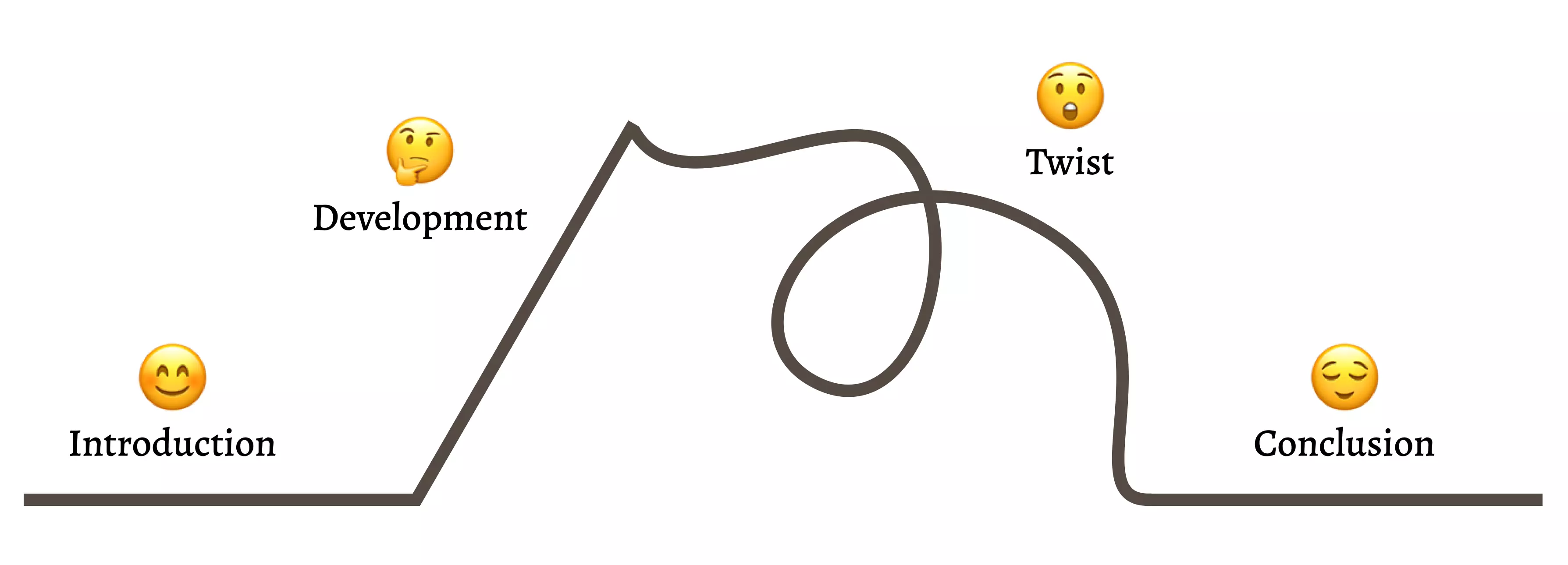
Kishōtenketsu is a four-stage narrative structure that suits stories like ours. It’s taught in Japanese schools and has its roots in classical Chinese poetry. The Ghibli film My Neighbour Totoro is a perfect example of a story that follows the kishōtenketsu structure:
- Introduction (ki): introducing the basic details of the world
- Development (shō): building on the information you gave before
- Twist (ten): a change in the narrative, the crux of the story
- Conclusion (ketsu): the resolution and how the world is now different
A visual representation of kishōtenketsu.
To show how powerful this structure can be, I’ve created an example case study which you can find on my website. Reading through it you can see the kishōtenketsu narrative structure:
- Introduction: I’m a UX Designer working on an app that helps new pet owners buy toys and treats for their pets.
- Development: From user feedback, we know that customers are struggling with a particular task.
- Twist: I used my design skills to improve the app to solve that pain point.
- Conclusion Everyone’s happy with the design update and the customers are no longer struggling.
Even without showing you any of my design outputs, the narrative shows what I can do. That’s why it works so well. You can sell your value as a designer through the plot alone.
Now I’ll go into the full breakdown of why and how I created this simple design case study using kishōtenketsu and a bit of critical thinking.
Introduction
To start this off, we need to prepare our setting. You’ll need to introduce the product, the customers, and where you fit as a character into the story.
The product
Odds are that unless you’re working at a well-known company, the person reading your case study won’t know much about your product. The very first thing you should detail in your case study is what you’re working on.
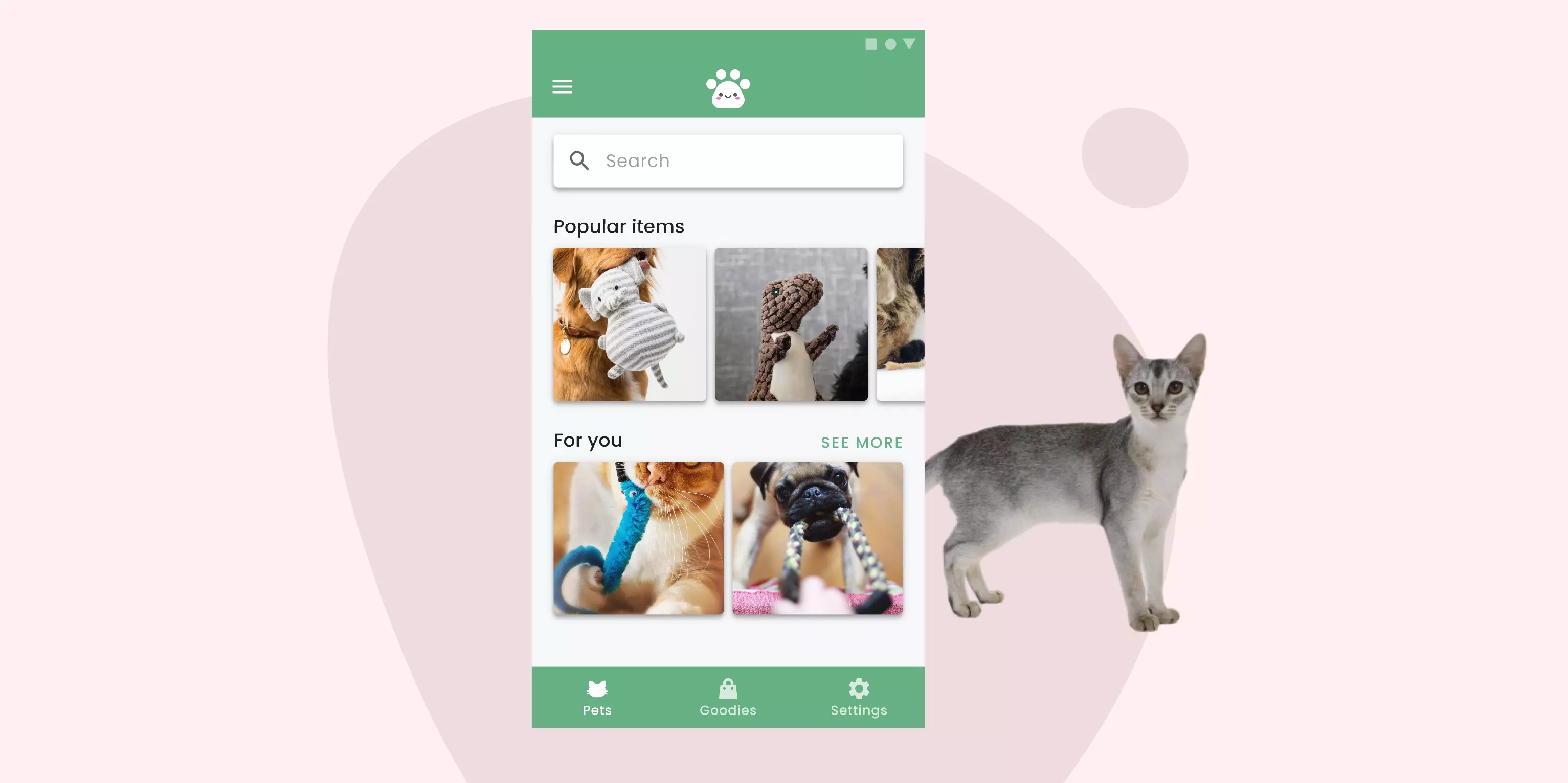
For this article, I’m going to use this fake app I’ve created called Petsy. It’s an app that pet owners can use to buy new toys for their cats or dogs. It’s aimed at young professionals who have bought their first pet during the lockdown.
And here’s how I would introduce this app:
Over the 2020 pandemic, pet ownership amongst young people in the UK has grown to almost 35%. Petsy is an app that helps new pet owners find toys and treats for their new furry companions.
In a couple of sentences, I’ve described the most important things a hiring manager would need to know about the product. Paired with the screenshot, it’s the fastest way to introduce the app to someone who may only have a few seconds to read the case study.
This paragraph also mentions who the app’s target customer is and why we’re focusing on them. No need for personas here! With a single sentence, your reader now knows roughly who you’re designing for.
Where you fit in
With the product introduced, you can now talk about your role in the team and why you were there. This is important because it frames the direction your story will take.
So in my example case study, my introduction looks like this:
As the sole designer on the team, my role was to help improve their new social feed. This feature helps pet owners to share their recent purchases with other Petsy members.
This part is flexible but it should always add to the setup of the narrative. So for example, if you were working with other people, you could explain who they were. If your case study is time-restricted, you could describe that here.
Once you’ve got the introduction sorted, you can bring the reader further into the story by adding some more details.
Development
The second stage of the case study narrative moves the story forward without changing the setting. Before you start your design work, it’s good to give some context around why you needed it in the first place.
To keep a case study simple, I’d suggest focusing down and solving one problem at a time. Doing this makes your narrative easier to write as you can stay focused on one thing. Plus, it’s how designers actually solve problems in their job, one step at a time!
Here’s the problem I described in my Petsy app example:
During a usability testing session, we discovered that a significant number of participants were struggling to post a photo. This was a problem as the majority (5 out of 7) had earlier expressed an interest in this but couldn’t discover how to do it.
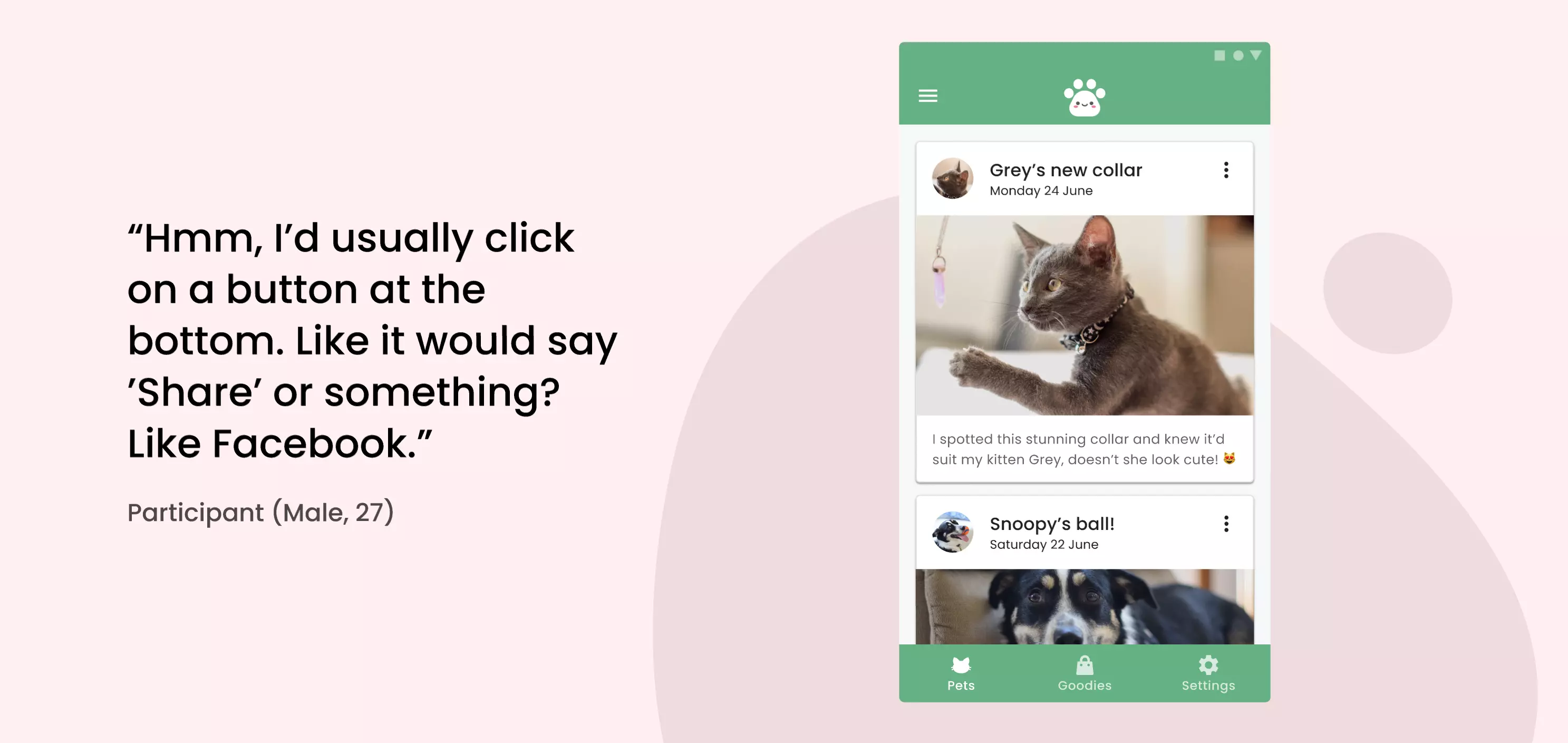
If you have evidence of the problem, show it here. One way to do this is with user testimony. You could pull out quotes from your test or share a customer support email. You can also add product screenshots so the reader can spot the problem themselves.
Showing the quote next to the problem area can be helpful.
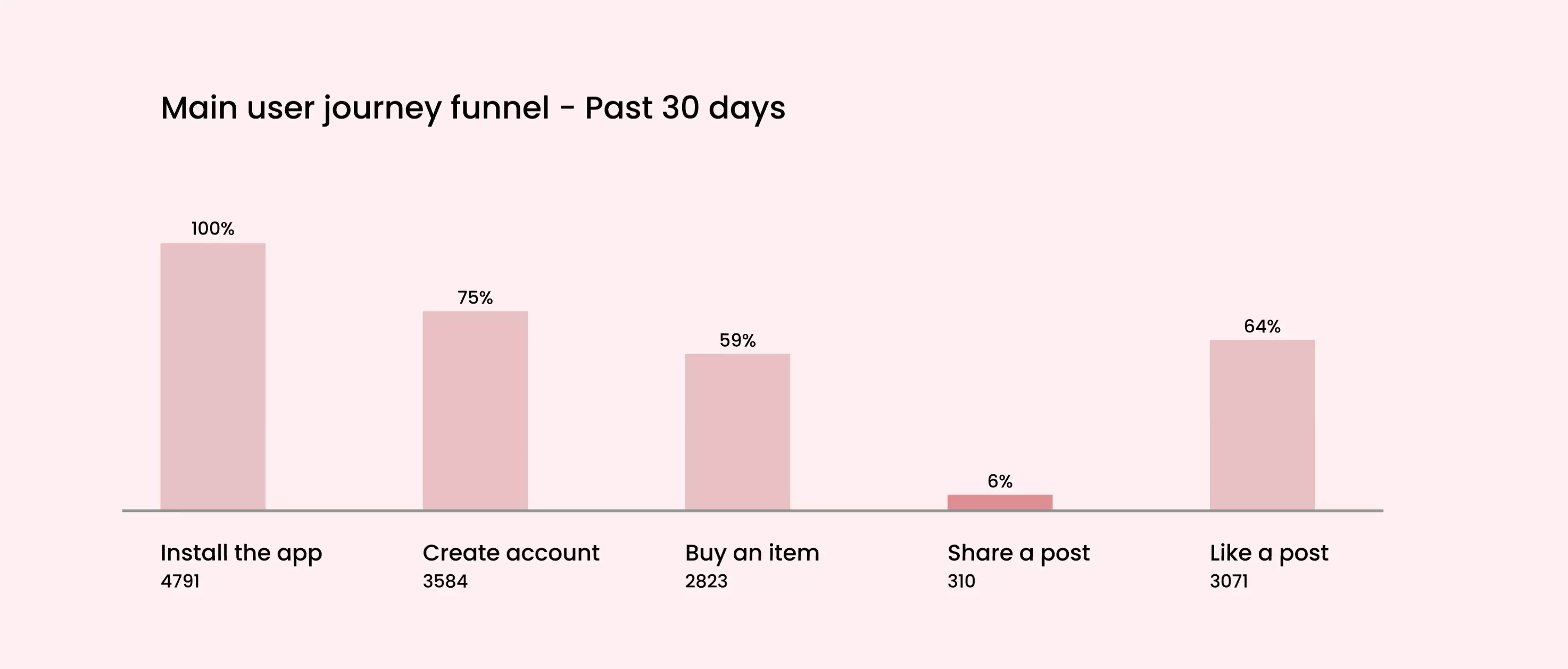
Another impactful way to make someone care about the design problem is to show them some numbers. If you have access to your product’s analytics data, you can show through the funnel that what you’re designing will solve a known and painful problem.
The right graph can deliver a point beautifully.
Too often I’ve seen redesigns that aren’t backed up with solid evidence, which makes me question why you’re doing a redesign at all. Persuade your reader that your design input was needed. You can then wow them with your redesign process and results.
Twist
The third step in the narrative is the shakeup to the current state of the world. You’ll enact a change then show what happens to the story because of it.
In a case study, this will make up the bulk of the kishōtenketsu structure because it’s where you get to showcase your design thinking. But you need to be mindful. The things you choose to highlight here will make the difference between an average case study and something unique.
Focus on the why
Calling back to what I said earlier, a good storyteller focuses on their purpose rather than their outputs. There’s nothing more boring than a page full of wireframes with no explanation, especially to other designers reading your case study. They’ve seen it all before, right?
What a hiring manager cares about is why you’re making wireframes. They want to know you aren’t doing them because someone told you to, but that you understand why it’s a useful exercise.
For each step you go through, it’s important to get across these things:
- Why you think it’s valuable to do
- How you set things up (the people you talked to, the questions you asked)
- The key things you found out
- Why they’re important in the next stages of design
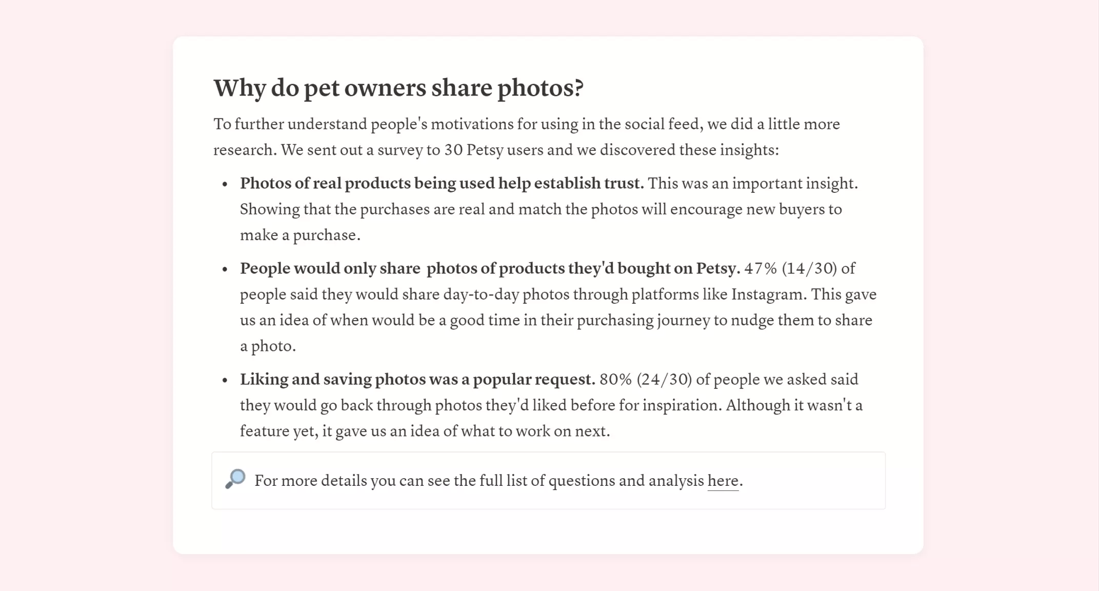
The example I used in my Petsy case study describes a survey sent out to users to understand why they wanted to upload a photo in the first place. I chose the survey because it’s a quick way to get tangible feedback. The results from the survey justified the design direction and gave us insights to use for future product developments.
The survey write-up I used in my example case study
Technical skills can be taught. What hiring managers look for in a designer is strong critical thinking and purpose behind every design task you do. Show them how you solve problems.
Show me your creativity
When I say this, I’m not talking about Dribbble shots. I’m talking about the ability to explore many solutions then whittle them down. Don’t just go with your first idea. Take time to think outside of the box, but then come back down to a handful of strong ideas.
Too often I’ve seen case studies that only show the final design, but that’s the dullest part! The people looking at your portfolio want to know your process and how you work. Why did you put the button there? How does it affect the other parts of the design? Sharing this thinking is part of your story, so it’s important to add it in.
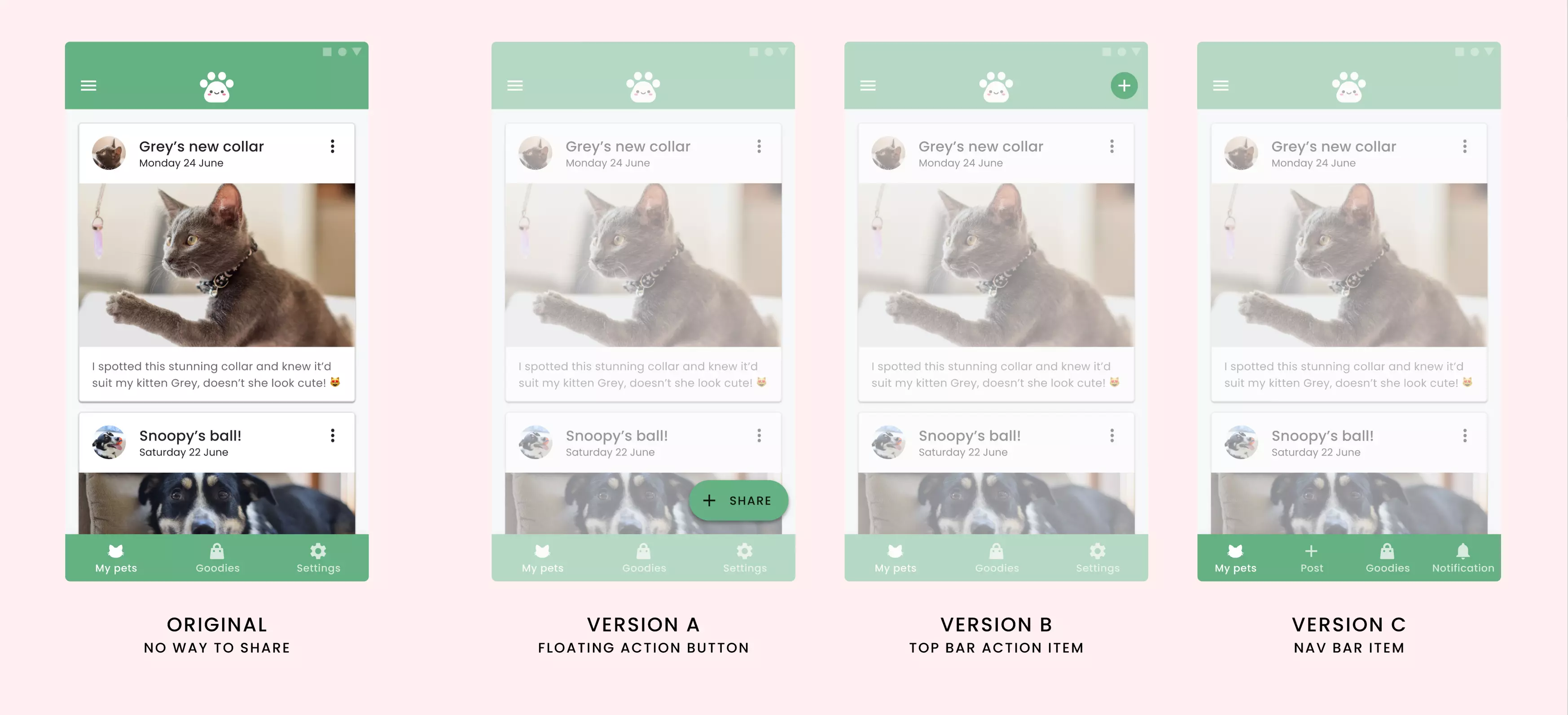
One thing that I’ve found works well is showcasing your new ideas next to the original. This way the reader can see for themselves what you’ve changed and why. If you want, you can also explain why you’ve made those design choices and how you think it will improve the experience.
There are many ways to “solve” the same problem.
Sticking to your first good idea can be a mistake. Sometimes a better solution takes a little more time and exploration to find. It’s why Stanley Kubrick does so many takes, to drive out the best he get can from his actors. I want to see that you’re able to think beyond the obvious solutions. Show me what you’re thinking!
Prove that it worked
All this effort would be wasted if it didn’t solve the problem you set out to fix in the first place. Show me that your design is an improvement. You can do this through testing, and even something as simple as getting feedback from your peers is helpful.
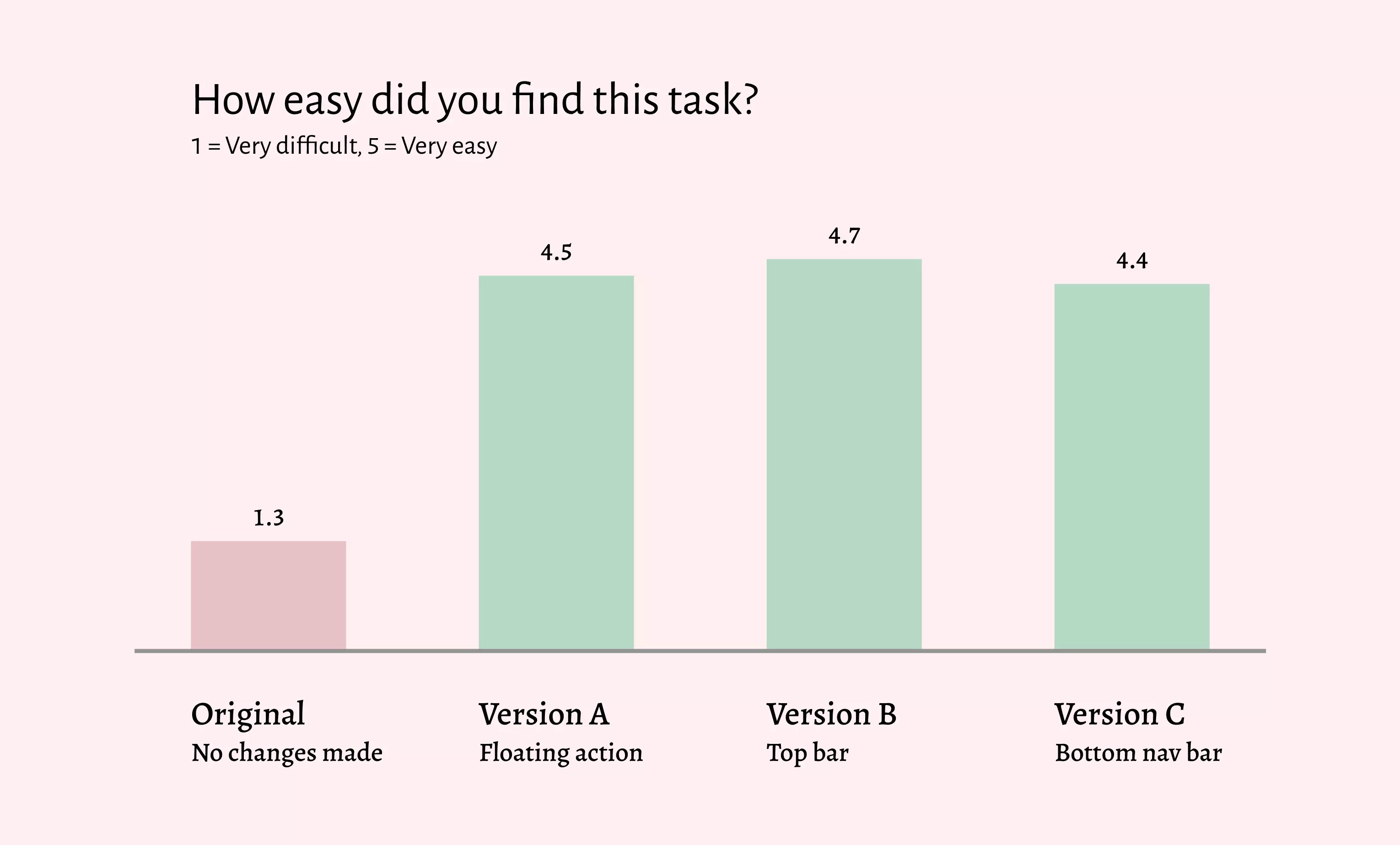
For example, if I performed an A/B test with the new prototypes and compared the results to the original design, I might see a graph like this one:
Clear and strong graphics can show how much a redesign helps.
Even without knowing all the details of the test, graphics like this can tell you the result. And if the reader’s sceptical, you can provide links to the full report for them to read for themselves. Breaking down the information this way is great for both page skimmers and the detail-focused readers. They both get the evidence that your redesign was a success.
In practice, when you change the design of a screen, it’ll have a tangible effect. Hopefully a positive one! Using research-based evidence in this way can show a business that your designs are doing more than “making it look nice”.
Conclusion
Now that you’ve gone through the journey, there needs to be a logical conclusion to the narrative. The world has been changed through the twist and we need to spend some time reflecting on that.
There’s a variety of ways you can end a case study’s story, and it’s up to you to decide on what that looks like. Here are a couple of options you could try:
- Reflecting on the things you learned as a designer, and how you’ve changed or grown.
- Looking back at the process and how you’d run the exercises next time.
- Discuss the impact the design had on the business, or if it uncovered any new issues for you to solve.
- How you worked with the developing team to get the designs built. What did you discuss, how did you support them?
Every narrative needs a solid ending. Without it, the reader may feel unsatisfied which isn’t a good lasting impression. The conclusion is your chance to reflect on your work, which is another underrated skill for designers.
When you’re getting someone to invest in you, you need to be persuasive. It’s not enough to show your designs anymore. To stand out, start selling people the vision of what it’ll be like to work with you. Get someone to believe in what you’re doing and they’ll join your side. They’ll get you where you need to be.
I’ve included the Petsy case study in full on my website so you can read it without interruptions. Feel free to use it as inspiration but please don’t just swap things in! The point I’m making is that you need to think a little more about your narrative. Stop using templates. Think critically, and tell your own story.

