As of recent, I’ve really enjoyed being able to network and be immersed in powerful discussions and debates surrounding a plethora of issues the latest social media app Clubhouse. The audio-based social networking app allows millions of professionals to connect globally, whilst giving regular voices a platform which mimics that of a megaphone— in a way which other social media sites have yet to do so. However, one thing that I can’t seem to shake off, is how this app can be exclusionary for people with audio or visual impairments. One of the biggest tell-tale signs of inaccessibility is that there are no live captioning, which means those with less than perfect hearing (or none at all) are excluded from app. Moreover, from a visual standpoint, the app doesn’t have any feature which supports text-resizing nor or Apple’s Voice-Over screen reader. This means
In order to understand more about what its really like for a person with accessibility requirements to use Clubhouse, I conducted a 1–1 interview with participant X — a university student with an auditory disability in order to understand what her experiences have been like using the app.
Q: How would you describe your auditory disability?
A: I’ve partially lost the ability to hear in both of my ears. I would be considered as being moderately-severely deaf. It affects my ability to communicate and interact with others.
Q: What made you excited to try ClubHouse and check it out initially?
A: I was really curious about Clubhouse, because at the start of the year, it was something that was really fresh — I know that some of my peers jumped for joy when they first had their invitation accepted because we were of the belief that loads of professionals were on the app and they were also looking to connect with others. I also thought it would also be a great venture to make friends — especially since I’ve been stuck at home for over a year due to lockdown.
Q: As someone in the DHHC (Deaf and Hard of Hearing Community) how do Clubhouse’s current offerings make you feel?
A: Personally for me, it creates a lot of anxiety — and its just one of the many reminders that the digital world throws out — that users like me simply don’t exist. It does feels like the app never really had anything accessibility related in mind. exclusionary politics is very harmful — the feeling of missing out isn’t nice at all.
Without the live captions, I often miss a lot of the conversation and with the With different voices, my brain has to do a swap to figure out who’s talking even though the app does have a highlight to show who’s talking. I process sounds about a few second behind —and it becomes very overwhelming and exhilarating to keep up.
Q: When it comes to audio content, what do you need so that you can experience it like people who have at least partial or full hearing?
A: For myself, live captioning next to the speaker’s name would help immensely. Also, a larger highlight area around the speaker would help me to distinguish who is talking- currently, the layout scheme seems pretty colour blended.
From my interview with Participant X, one thing becomes particularly evident to me. The truth is simply black and white — a good accessibility-conscious organisation knows that prioritising accessibility is part and parcel of developing and shipping a great product. However, unfortunately for many user’s with accessibility requirements, this isn’t anything new — and in fact, for decades, those who have consistently advocated for web accessibility have been those with lived experience of being excluding from the new digital world. Having to take a front-line position in advocating for merely being able to access the many opportunities afforded to us by this new digital age is taxing — and very emotionally draining to say the least.
What programmers and designers need to understand is that Web accessibility isn’t just a ‘trend’ or a legislative rule that you must adhere to, it should be a real-time commitment — which ensures that at the very heart of every design process, equitable design should be at the forefront of how we navigate and understand a user’s need. What does this mean for designers and programmers? Central to our ambition of ensuring that We should consider how we can include accessibility in test strategies and approach, we use
Why is accessibility and equitable design important? — I hear you ask!
Around 2 billion people in the world have some form of accessibility requirement. One big misconception is that accessibility issues only impact people with disabilities — but that narrative is false, as it this topic covers a range of areas such as; language, culture, digital literacy, cognitive, visual, hearing, motor abilities. All of these factors need to be taken into careful consideration when designing an end goal product for our user’s.
The insidious impact of digital exclusion can be understood, when you realise that much of the way in which we perceive, understand, navigate and interact with today’s modern world is experienced through digital technology. This is particularly true when you think about how much of the way that we’ve still been able to navigate the world whilst being closed off from much of it during the pandemic, is through the digital world. Many of us still enjoyed the luxury and privileges of being able to have full access to work, socialising, news, education, and opportunities— all a click or two away. However, for many people with accessibility requirements, this wasn’t always possible.
As a teacher, inclusive education is at the very heart of my pedagogical practice. At the crux of my teaching philosophy, I ensure that I never make any assumptions — and never use a one size-fits all approach and by doing so — I’ve made a conscious decision to provide a safe space for ALL learners — irrespective of their needs. Contrary to what some may believe, inclusive learning doesn’t mean re-inventing the entire wheel, or further exclude children with SEND by presenting them with classwork that completely contrasts with what the rest of the class are learning, it merely means being able to deliver information in a manner which is digestible and easily accessible (e.g. using both concrete and abstract means of teaching); and present them with classwork that is not only accessible for them — but also challenges them too.
Back to the example of using concrete and abstract concepts to engage learners with different needs (first showing learners concrete objects and then explaining the abstract concept to children) is important, as it can help to seamlessly break down information by first allowing learners to visualise the concept, then consolidate that learning through the abstract. Without doing this, it makes it hard to deliver learning with a very smooth scaffolded approach. Similarly, UX designers also need to consider how inaccessibility can significantly disturb the seamless experience of a user’s journey. e.g. a user wants to buy food from a food delivery service, but there is no writing to go with the icons — lets say that the icons here represent the concrete, it would be very hard to conceptualise what they mean without the abstract — particularly for user’s with accessibility requirements. Moreover, the same issue would arise if there were icons without any texts, this would disturb the experience of non-literate users be able to access this information. Clearly, in both scenarios, the design of that website or app wasn’t designed in a manner that would allow you to easily accomplish your tasks and you are unable to move through the user journey. This is where equitable design becomes a real necessity for designers.
Imagine a world where schoolteachers were to ignore the needs of children with additional needs
for starters, school wouldn’t be a safe environment for some of our most vulnerable children — and secondly, teacher’s wouldn’t be fulfilling their mandated duty to ensure that learning is for everyone. Now, apply this same logic to design processes’, similarly to inclusive education, equitable design serves the purpose of ensuring that there is meticulous planning that goes into ensuring that accessibility requirements are at the forefront of all designs — otherwise you risk marginalising and further ostracising by making it difficult from them to accomplish your tasks easily. Moreover, think about the emotional toll that the anxiety of navigating this digital space can have on an individual — it can cause a lot of stress and may cause some user’s to give up on it completely. Just like the example of a world in which schoolteachers were to consciously ignore the requirements of children with additional needs, think about how inherently violent digital spaces are when designers fail to consider or acknowledge the needs of those with accessibility requirements.
How could you improve accessibility in your designs?
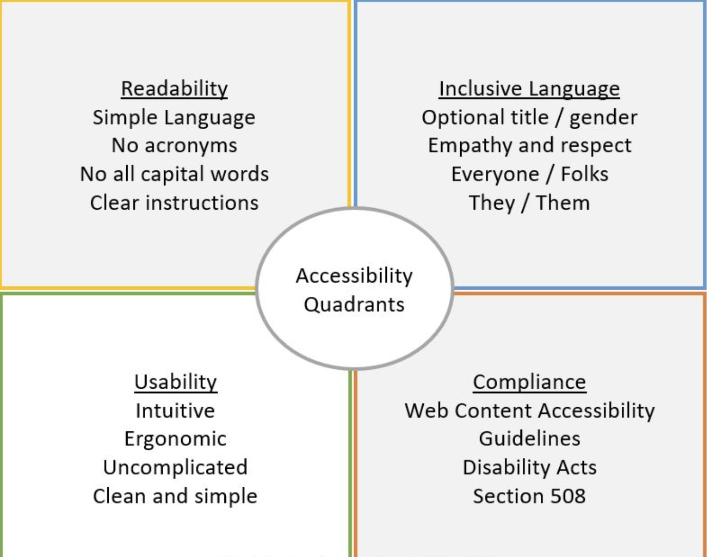
From a UX perspective, this quadrants gives you a brief overview of how you could implement a more inclusive design. It also gives you a great reference point of the key legislative policies that ensure that web developers and design are following guidelines to ensure that inclusivity is central to our objectives.
What lessons can be learned here?
As a UX designer, one thing that I’ve learned through the process of improving my craft is that equity based design is a process — not a destination. There are going to be many factors that you will need to consider — but it’s vital that you never overlook opportunities to use everyday technologies in new and unexpected ways that could potentially improve users’ lives and help to solve accessibility problems. As the role of UX designers is to build products for people, the end goal should be to include people with different needs and ensure that they can partake in the digital world — just like anyone else should be able to. This is why being resourceful and mindful makes a massive difference to user experience.


