You’re designing, doing the whole 9-yards — researching, sketching, validating ideas, and so on.
You hand things off to the engineering team, dust off your hands and pat yourself on the back for a job well done.
You ship, and crickets! Nobody uses your product the way you want them to.
What gives? Well, there’s a good chance you simply don’t understand your user’s decision-making equation well enough. I’m not much for math (basically flunked it in high school), but this is one formula that has repeatedly improved my designs throughout my career.
When humans make decisions, it is rarely if ever a single variable consideration. It’s not “Do I want this or not?” — rather, it’s always more nuanced and more complex. In the real world, it’s likely something closer to “Do I want to do this given what I know about what will happen, given what it will cost me, given how much time it will take me, the potential headache of screwing up, etc.?”
The clearer a picture you have of what the user is weighing in his or her mind before acting on your product, the more of an understanding you’ll have about why they’re acting the way they are. In the best cases, you’ll be able to predict how they’ll act, before a user ever tries it.
Let’s use referrals as an example. I was recently designing a referral program with a reward — if you referred a friend and he/she made a purchase, you’d get 20% off your next order. Pretty simple right?
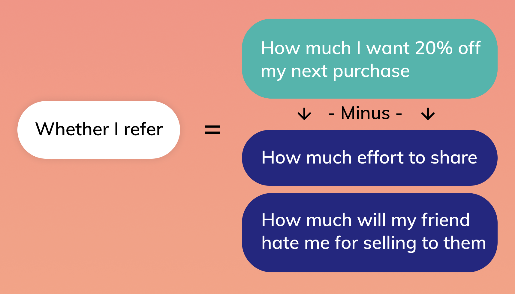
If we break down what we know about the user’s decision-making equation, on a rudimentary level it would look something like this:
Light Blue = Value/benefit, Dark blue = what it will cost me
But this is a gross oversimplification of what a user’s decision-making process is! If we only considered this level of detail on the user’s decision-making equation, we would certainly fall short of being able to understand and/or predict what people will do. The best designers understand the push and pull forces of a decision on a much lower, deeper level.
Let’s try again.
With the current designs, here’s the point in which the decision is made:
- 1. Just finished making a purchase
- 2. Sees an offer to refer a friend for 20% off his/her next purchase
- 3. Decides whether to click a “Share Now” button
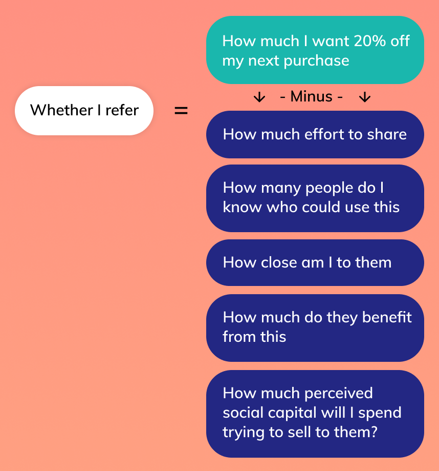
What’s going on in his or her mind? What’s the decision-making equation?
Light Blue = Value/benefit, Dark blue = what it will cost me
The bigger the positive difference between the value and cost, the more likely I will share, and the less time I will likely take in making that decision.
As a designer who’s trying to increase referrals, the question we should ask ourselves is “how can we make that equation overwhelmingly positive?” The more of a no-brainer decision it is, the more successful our design will be. So, let’s look at the equation again and see if we can add a few things to drive up value and drive down cost:
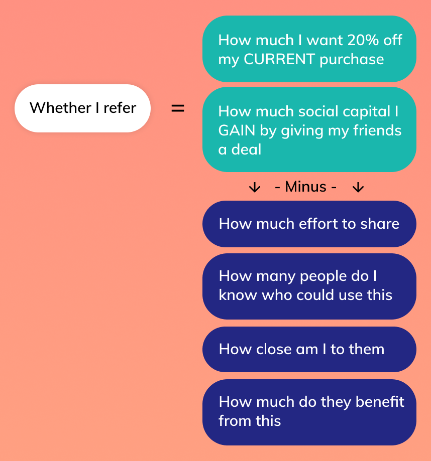
- 1. Maybe 20% off the user’s next purchase isn’t that valuable. How about we do 20% in cash back on the order the user just made instead? Would that drive up the value side of this equation?
- 2. What if we also let the user give friends a discount when sharing? That way, when the user sends a message to his/her friend it can almost look like they are doing their friends a favor. In that way it becomes less of a cost, and more of a value.
- 3. “Share Now” can feel intimidating. It has a time component “Now” which may add something else to think about to the cost part of the equation. It’s also an opaque CTA, and feels like a heavier commitment than say “Copy Share Link”
All of a sudden, if we swap a few of these pieces, the equation becomes a lot more positive!
Light Blue = Value/benefit, Dark blue = what it will cost me
The more positive it is — the more people we’ll see adopting this behavior that we’ve created. This formula applies to all decisions, big and small. For example:
- 1. What’s a user’s equation when deciding whether or not to hit your “Sign Up” button?
- 2. What’s the equation for deciding whether or not to upgrade to your premium plan?
- 3. What’s the equation for deciding whether or not to posting a new picture?
Remember — don’t stop at the surface level of value & cost. Drill deep into all of the questions and variables users are weighing. That way, you’ll find more potential pockets of opportunity to add value.
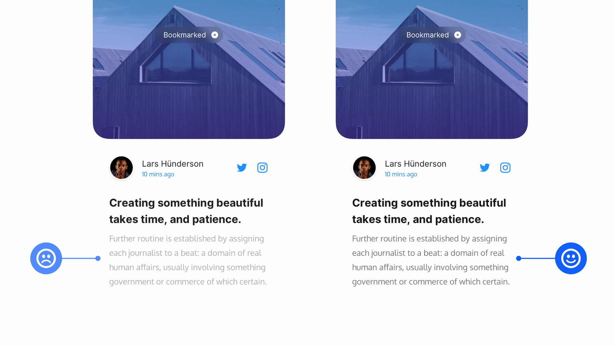
Maybe a question people have before they post a picture is “how private is this photo?” Even if the photo that’s posted is by default private, perhaps adding an indicator will then remove that question entirely and make the equation overwhelmingly positive.
Use this technique the next time you’re analyzing your design or someone else’s — and ensure you’re getting the results you want!
